Core elements
Logo
Clear and modular
How to apply our logo
The clear composition of the PPDS logo as a wordmark is well defined and assertive, while its modular design makes it iconic and distinct. It is the consistant foundation of our PPDS style. The PPDS wordmark perfectly represents the PPDS design approach to versatile application and simplification. Maintaining brand equity while reinforcing brand leadership, confidence and reliability. In white, bright blue, or dark blue the PPDS wordmark works across all media.
Construction
All letters that make up the PPDS wordmark are exactly inscribed in the area of the base unit. Line thickness is uniform and guided by a grid that adjusts both horizontal and vertical alignment.
Composition
The sequence of the elements must always respect the letter spacing as per instruction - for the three possible orientations.
Descriptor configuration
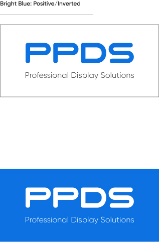
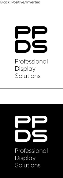
Professional Display Solutions is the descriptor that completes the wordmark. The main versions and the basic colour combination are described below.
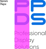
Minimum clear zone
The PPDS wordmark always has a clear space around it. This clear zone is equal to one quarter of the base unit area (x); no text or symbols can appear in this area. When the wordmark is used in combination with other trademarked names the clear zone is equal to the base unit area (4x).
Minimum size
The minimum wordmark size should be used only when layout space is extremely limited. Use a larger size whenever possible. Measuring the height of the base unit, the minimum starting size is 7mm in print, or 32 pixels on screen.

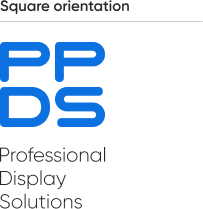
Varieties
The PPDS logo offers options with square or horizontal linear alignment, in the PPDS bright blue colour, for corporate communications.

Colour versions and backgrounds
In addition to the logos for corporate communications, positive and negative coloured versions, as well as a vertically linear option, can also be used for designed assets.